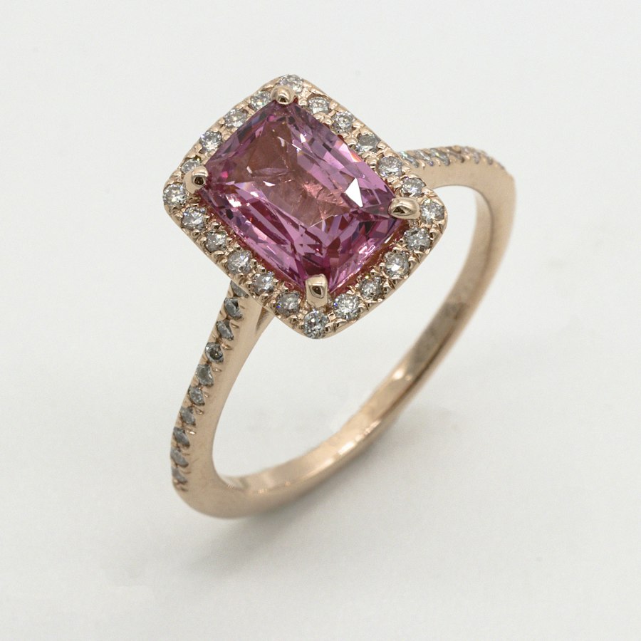
There is a particular kind of client who walks in carrying a screenshot from a 1920s auction catalog, a scan of their grandmother's ring, or a brooch they found at a flea market. They do not usually want that exact piece. They want the feeling of it — the lacy metalwork, the low profile, the way light catches a tiny rolled edge. That is the brief for a vintage-inspired engagement ring, and it is one of the most rewarding commissions we take on.
First, name the period you are reaching for
"Vintage" is not a single style. It is at least four distinct design languages, and blending them without intent reads as costume rather than heritage. Before we put pencil to paper, we pin down which era actually draws you.
- Victorian (1837–1901): romantic, floral, often clustered. Rose-cut stones, warm yellow gold, and engraved scrollwork. A favorite for clients who want soft, organic silhouettes.
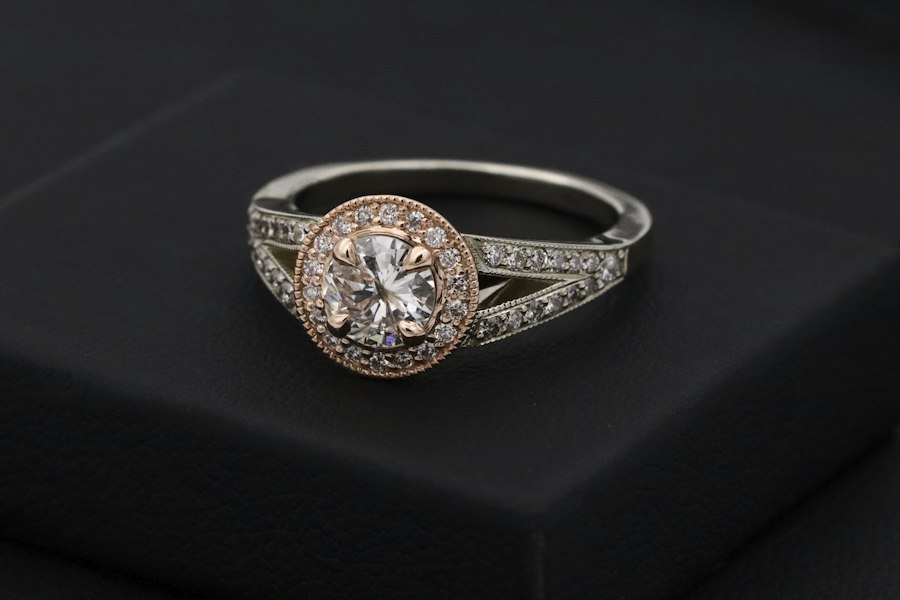
- Edwardian (1901–1910): the era of lace. Platinum let jewelers draw metal as thin as thread, producing milgrain borders, bows, and garland settings that weigh almost nothing on the finger.
- Art Deco (1920s–30s): geometric, symmetrical, and bold. Step cuts, emerald shapes, onyx and sapphire accents, tight channel settings. The most common vintage request we see.
- Retro Mid-Century (1940s–50s): chunky rose gold, sculpted curves, and bold floral motifs. Often overlooked, but wonderful for clients who want something warm and substantial.
Most clients say "vintage" but mean Art Deco. Naming the period precisely changes the whole drawing.
The stone decides how authentic the ring can look
A modern round brilliant cut, designed in the 1950s, will never read as 1925, no matter how Deco the setting is. If period accuracy matters to you, we talk honestly about cut. An emerald or old-mine-style cut sits far more naturally in a Deco or Victorian setting than a wide, starburst modern cut. We also discuss whether a slightly warmer stone actually helps — old jewelry reads warm, and a stone that looks too white can fight the period feel.
Authenticity lives in the details nobody lists online
When we reproduce a period look, we do not simply file down a modern solitaire and call it vintage. We rebuild the small details that make the style recognizable:
- Milgrain: the tiny beaded edge along a rim. It must be rolled by hand, not stamped, or it looks flat and mechanical.
- Pierced gallery: the openwork beneath the head lets light pass through, rather than bouncing off a solid wall of metal.
- Low profile: period rings sat close to the finger. A tall, modern cathedral setting breaks the illusion instantly.
- Hand-engraved scrolls: cast scrollwork always shows a slightly muddy edge; engraved lines stay sharp for decades.
Common vintage mistakes we steer clients away from
We have seen the same errors recur over years of commissions, and they are easy to avoid once you name them. The first is overdoing the vintage: a Deco ring does not need filigree, onyx, sapphire accents, and a cluster setting all at once. Choose one or two period signatures and let the rest stay quiet. The second is choosing a stone that fights the era. A warmly toned diamond reads authentically in a Victorian cluster; a brilliant white modern stone reads out of place. The third is forgetting that vintage settings were built for a slower life. We add hidden reinforcement to the prongs and shank so the silhouette stays period while the structure survives daily wear. Get these three decisions right and the ring will read as a well-loved heirloom, not a costume piece.
Modern durability, period silhouette
This is the tension in every vintage commission. A 1925 ring was built for a life that did not include dishwashing, typing, or gardening. We keep the silhouette but quietly modernize what fails over time: the prongs get a touch thicker, the underside is comfort-fitted, and we avoid the thinnest Edwardian filigree on a ring that will be worn every day. You get the look without the fragility.
Start from a feeling, not a snapshot
If you bring us a Pinterest image, we treat it as a starting point, not a blueprint. Photos are lit, staged, and shot at angles that flatter. What we want to know is which part of the image drew you — the shape of the setting, the color of the metal, the quietness of it, the way it sparkles. Once we understand that, we can build a ring that borrows the feeling while fitting your hand, your lifestyle, and your budget. Period-inspired jewelry done well does not look like a costume. It looks like a piece that somehow always belonged to you.