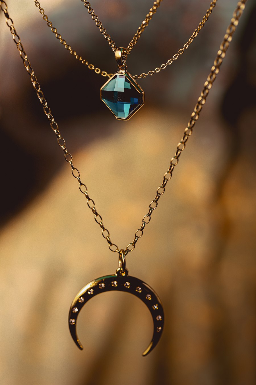
Most couples walk into a first consultation assuming they have to choose one metal for the ring. Yellow or white, rose or platinum. After ten minutes looking at samples, the more interesting question usually comes up: can we use more than one? The answer is yes, and mixed-metal design is one of the most effective ways to give a custom ring personality without spending more on stone weight. The trick is that mixing gold colors is easy to do and hard to do well. A ring that uses three metals with no clear hierarchy looks like a mistake, not a statement.
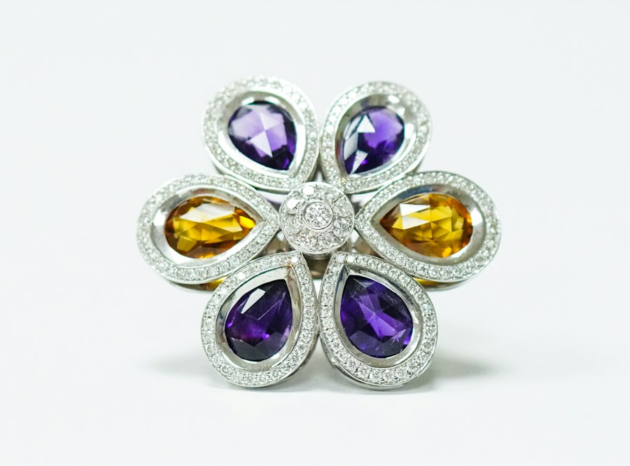
Before we talk about proportions, it helps to understand what the colors actually are. Fourteen-karat yellow gold is alloyed with copper and silver to get that warm, classic tone. Fourteen-karat rose gold leans harder on copper, which is why it also runs slightly harder and can develop a deeper patina over decades. Fourteen-karat white gold is alloyed with nickel or palladium and almost always finished with a thin rhodium plating to make it look bright. Platinum sits outside the gold family entirely and reads as a cooler, denser silver-white. When you mix these, you are mixing alloys with different hardnesses, different expansion rates and slightly different colors under different lighting.
The atelier rule we lean on is a 70/20/10 balance. One metal does roughly seventy percent of the visual work, usually the shank and the main band. A second metal takes about twenty percent, used for the gallery, the basket under the stone, or the inner edge. The third metal, if there is one, takes ten percent or less and behaves almost like an accent stripe. When the ratio creeps toward fifty-fifty-fifty, the eye cannot find a place to rest, and the ring starts to look like it is arguing with itself. Clients sometimes want the split exactly down the middle because it sounds symmetrical on paper. In practice, a dominant metal almost always photographs and wears better than an even split.
Skin tone is the next lever. Rose gold tends to glow against warm, olive and deeper complexions, while bright white metal reads cleaner against cooler and paler skin. But mixed metal is the perfect compromise when one person cannot decide. A yellow gold shank with a white gold setting under a diamond gives the warmth of yellow metal next to the hand and the bright contrast of white metal around the stone, which actually makes a colorless diamond pop more. Rose and white together is our most-requested combination for clients who want something romantic but not old-fashioned. Yellow and rose together reads very warm and works beautifully on tanned or golden skin tones.
Durability is where mixed-metal commissions separate the confident jeweler from the reckless. Dissimilar metals expand and contract at slightly different rates when heated, so the join between them has to be designed, not forced. A thin sliver of rose gold inlay across a wide shank is fine. A full ring built as three separate soldered arcs with no transition structure can open up over years of wear. We usually build the dominant metal as the structural shank and add the accents as inlay or as a sleeve, which keeps the piece strong. Nickel-alloy white gold against platinum also creates a galvanic question in very wet environments, so we tend to pair palladium white gold with platinum rather than nickel white gold when the two touch directly.
Where you place the second metal changes the whole read. A split shank that shifts from yellow at the base to white near the diamond draws the eye upward toward the center stone, which is exactly where you want it. A thin rose gold line running around the inside of a white gold band is a hidden detail only the wearer knows about. A two-tone halo alternates small white and rose gold beads around the outer edge and reads as intricate without costing much more. We almost never recommend mixing three metals on the same surface area that already has a colored center stone, because the stone itself is already carrying color.
The most common mistake is treating the metal choice like a paint palette. Clients bring in rings where the shank is yellow, the prongs are white, the halo is rose and the engraving is another color, and ask us to replicate it. We gently steer them down to two metals unless there is a very specific reason for three. Fewer colors, clearer hierarchy, better result. Mixed metal is not a challenge to see how many tones you can fit on one finger. It is a way to make one ring feel like it belongs to one person.
If you are undecided between gold colors, a mixed-metal commission is often the answer rather than the exception. It lets you honor both a warm and a cool preference, it ages in a way that feels layered rather than uniform, and it photographs beautifully. The place to start is not with the second metal. It is with deciding which metal does the talking.
For more on choosing the base metal before you layer colors, read our guide on platinum versus 14k versus 18k gold, and see how matte, polished or brushed finishes change how those colors read on the hand.