Clients often arrive at the bench already convinced. "I'm a white gold person," they say, or "yellow gold only, my mother wore it." Sometimes they are right. Sometimes they have simply been told one metal suits them for years and never tested the other. Because we build rings to order, we get to experiment before committing to a metal — and the experiment usually surprises at least half of them.
Undertone is not the same as skin depth
The first thing we teach clients is that "warm" and "cool" do not describe how dark or light your skin is. They describe the color that comes through underneath. A very pale person can have a warm, olive undertone. A deep-skinned person can have a cool, pink one. The quick tests we use in the studio:
- The vein test: look at the veins on the inside of your wrist in natural light. Blue/purple veins suggest cool undertones; green/olive suggest warm.
- The jewelry test: which metal do you already wear without thinking? If yellow gold always makes your skin look alive and white gold makes you look tired, that is data.
- The sun test: do you burn easily and pinken? Cool. Do you tan deeply and rarely burn? Warm, often.
If you land in between, you are neutral, and nearly every metal flatters you. That is a genuine advantage.
What each metal actually does on the hand
Yellow gold, white gold, rose gold, and platinum each interact with skin differently, and it helps to know what you are asking for.
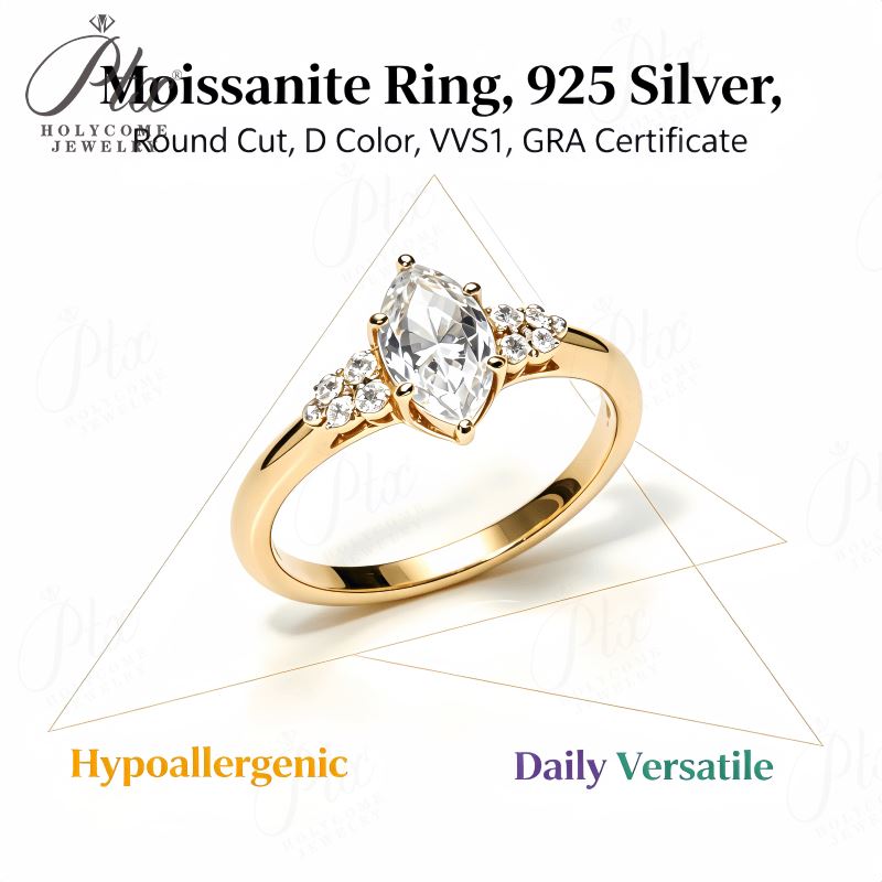
- Yellow gold sits warm against the skin. It makes warm undertones glow and can make cool, pinkish undertones look sallow — unless the stone inside it is bright and clear, which re-balances the contrast.
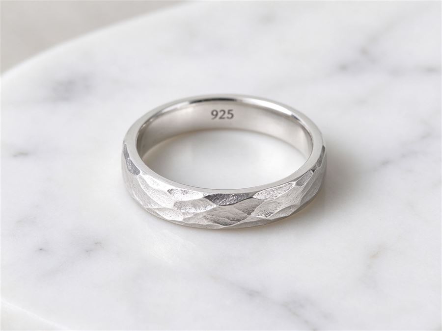
- White gold (rhodium-plated, as nearly all of it is) reads crisp and silver. It flatters cool and pink undertones and can make warm, olive skin look dull, especially in a wide band.
- Rose gold is the wildcard. The copper in it warms nearly every skin tone, which is why it has stayed popular for a decade. It is especially kind to neutral and deeper complexions.
- Platinum reads slightly softer and grayer than rhodium-white gold. It is often more forgiving than white gold on warm skin, because it lacks the harsh blue cast of fresh rhodium.
Wardrobe is part of the decision
A ring is not worn in isolation. It sits on a hand that reaches toward sweaters, shirts, and a watch you already own. If your wardrobe is dominated by navy, charcoal, and cool greys, white metal will feel at home. If you wear camel, cream, rust, and olive, yellow gold will quietly belong. We have talked clients out of a metal they loved on the bench because it fought the clothes they actually put on each morning. That sounds superficial, but it is the difference between a ring you wear and one you rotate out.
Eye color and the rest of your jewelry box
Undertone is the main signal, but two quieter cues help. First, eye color: green and hazel eyes often read beautifully beside rose gold, while blue and grey eyes get a lift from cool white metals. Second, the jewelry you already wear. If your jewelry box is half silver and half gold, you are the ideal candidate for a two-tone commission — the ring will feel like the pieces you already own, not a new accent. We have had clients arrive convinced they wanted yellow gold, try on a white gold band in the studio, and change their minds in ten minutes. That is not indecision. It is discovery, and it is exactly what the bench consultation is for.
You do not have to choose forever
Here is the freedom bespoke gives you. A two-tone design lets you split the difference. A yellow gold shank with a white gold halo flatters both undertones at once. A rose gold prong on a platinum band is a tiny bet-hedge that costs almost nothing. We have built dozens of rings that read as one color from across the room and reveal a second color up close.
If you are genuinely stuck, we also suggest borrowing a friend's ring in each metal and wearing both for a weekend. Skin tells the truth over 48 hours far better than it does in a showroom under bright lights. Then come back and tell us which one you stopped noticing — that is the one that belongs on your hand.
The metal should disappear, then delight
The right metal is not the one that draws the eye. It is the one you stop seeing after a week, except in the moments light catches it and you think, that color is nice. That is the standard we design toward — a metal that suits your skin, your wardrobe, and the life the ring will actually live in, not the one that was fashionable the year you got engaged.